

Why "Light & Airy" Photos Can Look so Bad

So you got engaged, and you’re beginning your search for a photographer that has that perfect “instagrammable” look! As you’re searching through hundreds of Photographers you’re seeing all these beautiful, bright white photos with soft colors that look just like a dream. It’s definitely the most popular wedding trend in photography, but there are some cons to having your wedding photos done in the “light & airy” style. Especially if you go with a photographer who may be slightly uneducated in the editing side of photography. So what is so wrong with the light look?
Well if you’re looking to just post your photos online, it’s not too big of a deal. However, if you or your family want to print one of those bright white photos you’ll quickly notice how terrible of a quality they really are. You’ll find that the photo is typically “over exposed” (meaning it has WAY too much light added) causing it to lose all the details in the picture, which is particularly bad for a wedding dress. The whites are typically “blown out”, meaning the whitest parts of the image will have no ink when they are printed. High end photos should have little to no “blown out” sections of pure whites in their images. A good photographer knows how to get that same beautiful “airy” look without destroying the image quality, but this definitely takes more work and thorough education on the post-processing side of photography.
The Technical Side
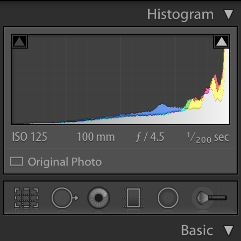
Histogram in Lightroom during post-processing.
There is a little info chart in our cameras and editing software called a “histogram”. The histogram shows the level of all the colors in the image. Understandably, this little box of information looks confusing and intimidating to most people, and I cannot tell you how many professionals I know who actually have no idea how to use it. Unfortunately, most photographers I know batch-edit their wedding galleries with a preset (one that they typically did not make themselves). These presets are basically the same thing as a “filter” on Instagram. The reason they use a preset is because it saves SO much time to put a single filter over the whole gallery and just call it a day. The problem with that method is that not every image in a gallery is made equal. Some shots are taken in low-light settings, some are taken in bright sunlight, and some in a perfect balance of both. You cannot put the same filter over an entire gallery without over or under exposing at least some of the images. A designer photographer (like myself) will open your gallery and spend the first day of editing simply fine tuning the colors and exposure to make the images cohesive, and true to your specific wedding day. No two weddings will ever be done with the exact same settings through my editing process. It’s unique to all the lighting in your venue, the colors you choose for your wedding, and the atmosphere and mood you’ve set for the day! Capturing all of this through lighting and color takes a lot of time, but whenever you have a high quality product, spending time is a necessity, and I have a very high standard for my images.
Quality Vs. Quantity
Unfortunately, many photographers are either uneducated on how to use a histogram, or they do not want to spend the time it takes to deliver quality images. Most couples trust their photographer (who is, after all, the “professional”) to know about the printing process and their own editing software, right? It’s sad, but it just doesn’t work that way. This is why you need to pay attention to how white the images are when you’re searching for the right photographer for you.
How to See Quality
You can see below a quality difference in a properly edited photo, and one that is done in a typical “Light & Airy” preset.

Properly Exposed
Beautiful! This image is bright, soft, and has that nice “Light & Airy” look to it, and still has beautiful details. This is because there is actually no pure white in the photo! Perfect for printing!

Blown Out
This image may look nice online, but it would look terrible as a print. A large portion of this photo is pure white, which means it has lost all the details in those sections.
Can’t see a difference? Look below to see the highlighted areas!
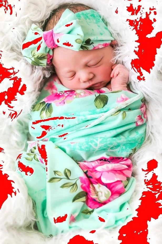
All of the areas in red are where the “blown out” whites are. These are the areas in the image that would not have any ink when printed.
My guarantee to you is that ALL of your images will be beautiful online AND will always be print worthy! I am here to help educate and deliver on Fine Art Photography and high quality prints. If you have any questions please leave them below, I am always happy to help!
